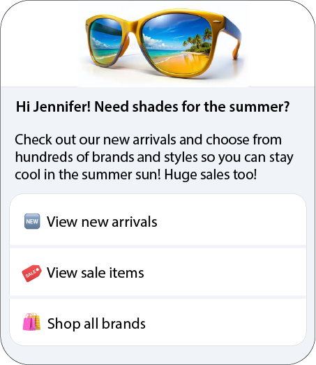
RCS Rich Cards and Carousels
Rich cards combine media, text, and suggestions to create a more engaging and interactive messaging experience. You can use them to highlight key information, offer clear actions, and guide users through a conversation more intuitively than plain text alone.
Carousels extend this concept by allowing you to present multiple rich cards in a single message, enabling users to explore and compare different options.
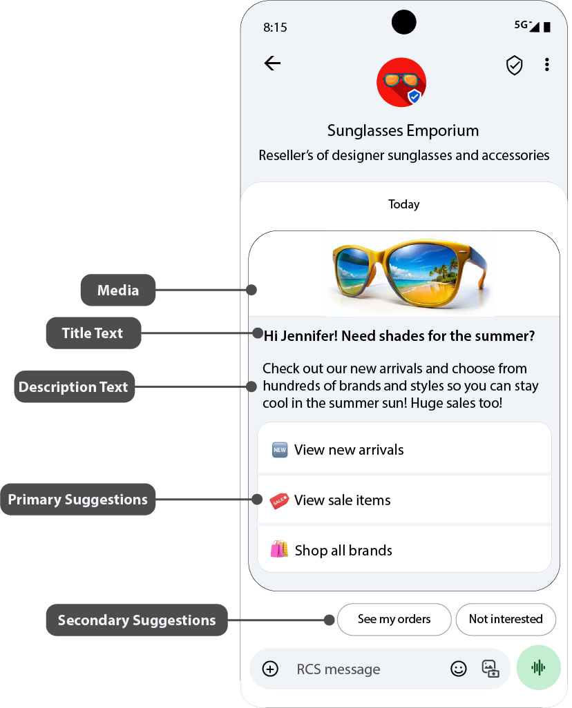
A rich card may contain:
- Media — images, GIFs, videos, or PDF files
- Title text — a headline or key message
- Description text — supporting information or context
- Suggested replies and actions — interactive options for the user
Sending PDF files in rich cards is currently supported only in India on the Google Messages client.
At least one of the first three elements (media, title, or description) is required.
Components of a Rich Card
Media
Rich cards support several media formats so that you can present your content most effectively:
- Images: JPEG/JPG, GIF, PNG
- Videos: H.263, M4V, MP4, MPEG, MPEG-4, WebM
- Documents: PDF (India only on the Google Messages client)
You can choose one of three standard media heights:
| Media height | Size |
|---|---|
| Short | 112 DP |
| Medium | 168 DP |
| Tall | 264 DP |
DP (density-independent pixels) ensures media displays consistently across different screen densities.
If the media doesn’t match the selected height, the system will automatically crop and zoom to center it. To control how your media appears, you can provide a custom thumbnail.

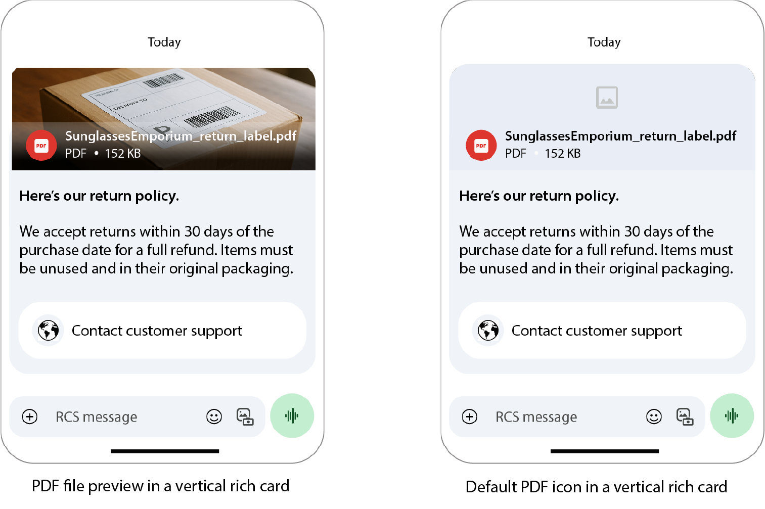
PDF behavior:
- A preview is generated from the first page of the file.
- If a preview isn’t available, the thumbnail or a default icon is displayed.
- Tapping the image opens the file in a viewer.
You can provide media by URL or upload it directly.
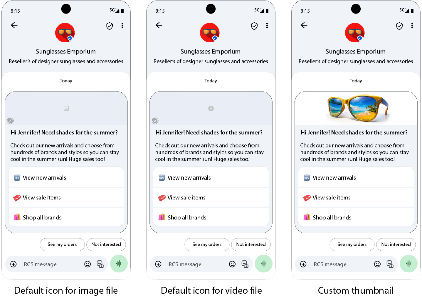
Thumbnails
Thumbnails act as the preview image for media and display during file download.
- Max thumbnail size: 100 kB (recommended: ≤ 50 kB)
- If no thumbnail is provided, a default icon appears.
- Thumbnails are also used as video previews.
Tapping the thumbnail or icon opens the media in full-screen view.
Title
The title is a concise headline designed to catch the user’s attention.
- Maximum length: 200 characters
- Special characters, such as emoji or multi-byte characters, count as multiple characters.
Description
The description provides supporting information or a call to action.
- Maximum length: 2000 characters
Suggested Replies and Actions
Rich cards can include up to:
- 4 suggested replies or actions inside the card
- 11 additional suggestion chips below the card
Suggestion chips should offer new ways to move the conversation forward and should not duplicate the options within the card or carousel.
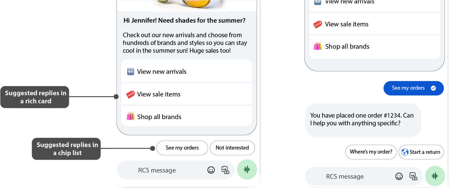
Suggested Replies
Suggested replies are predefined short messages (up to 25 characters) that let users respond quickly. They help streamline conversations and guide users toward relevant interactions.
Suggested Actions
Suggested actions link to native device capabilities, for example, calling a number, opening a map, or launching a browser. Only include relevant actions to avoid overwhelming the user.
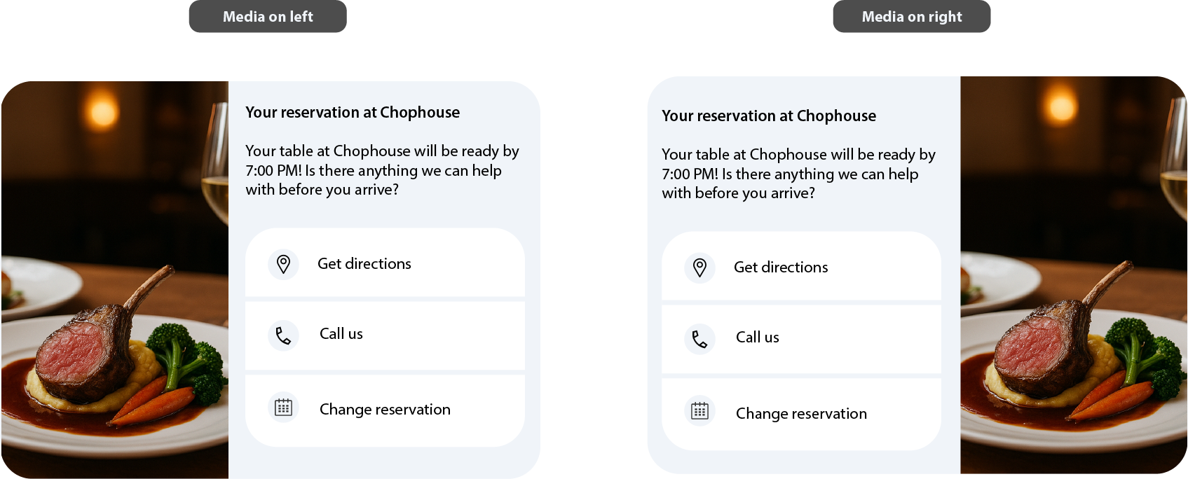
Rich Card Layout Options
Rich cards can be formatted either vertically or horizontally:
Vertical Layout
- Media appears at the top.
- Minimum card height: 112 DP.
- Supported media heights: 112 DP (Short), 168 DP (Medium), 264 DP (Tall).
- Supported aspect ratios: 2:1, 16:9, 7:3.
Horizontal Layout
- Media is positioned to the left or right of the text.
- Fixed media width: 128 DP.
- Height adjusts to fit the text content.
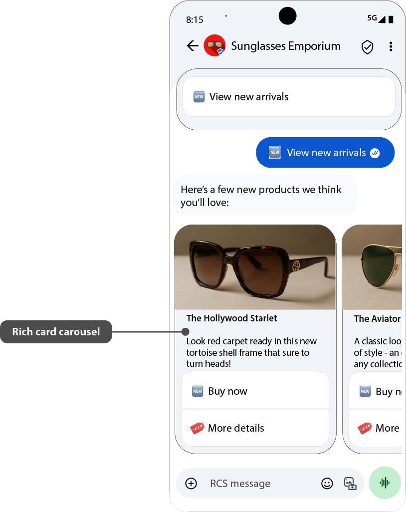
Rich Card Carousels
A carousel is a scrollable sequence of rich cards within a single message. Carousels are ideal when presenting multiple related options, such as plans, products, or locations, so users can browse and compare.
- Maximum number of cards in a carousel: 10
- Only vertical rich cards are supported in carousels.
The first card should highlight the best or recommended option.
Suggestion chips can also be placed below the carousel, but they should not repeat carousel content.
Carousel Specifications
| Specification | Detail |
|---|---|
| Title | Max. 200 characters |
| Description | Max. 2000 characters |
| Height | Small: 542 DP max Medium: 592 DP max |
| Width | Small: 180 DP (fixed) Medium: 296 DP (fixed) |
All cards are scaled to match the height of the tallest card. If content exceeds this height, the system truncates text in the following order:
- Description → single line
- Title → single line
- Suggestions → removed
- Description → removed
- Title → removed
Full-Screen View for Carousels
If card content is truncated, users can expand the card into a full-screen view to see the complete text.
How it works:
- A More button appears when content is cut off.
- Tapping the card or More button opens full-screen mode.
- Users can exit by tapping X, using the system back gesture, or selecting a suggestion.
Navigation in full-screen:
- Vertical scroll within the card for longer text.
- Horizontal swipe to move between cards.
Full-screen media specifications:
| Specification | Detail |
|---|---|
| Media height | 264 DP (Tall) |
| Media width | Screen width − 32 DP (16 DP margin on each side) |
How Suggestions Behave in Full-Screen View
| Suggestion Type | Behavior |
|---|---|
| Open URL | Opens in browser or webview. Returning to Messages restores full-screen view. |
| Dial / View Location / Calendar Event | Opens the relevant app. Returning restores full-screen view. |
| Share Location | Full-screen view closes, Google Maps opens, and after sending, the conversation view returns. |
| Suggested Reply | Full-screen view closes, and the reply is sent in chat. |
Character and Size Limits
- Title: up to 200 characters
- Description: up to 2000 characters
- Media heights: 112 DP (Short), 168 DP (Medium), 264 DP (Tall)
- Payload size: maximum 250 KB
Make sure your rich cards and carousels stay within these limits so that all content displays correctly.